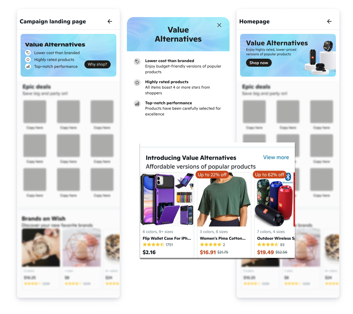
Business problem: Wish wanted to launch a collection of products generally known as "dupes." However, they wanted to build a differentiated style to help establish a unique brand identity and mitigate the risk of infringement. The company also needed a way to emphasize product quality without actually using the word "quality."
Solution: I named the program "Wish's Value Alternatives" to emphasize quality and affordability. Throughout the app, I deliberately avoided using terms like 'replica' or 'counterfeit,' and instead, highlighted the program's capacity to provide sought-after products at a reduced cost. I made sure the main points were easy to skim and followed a well-organized hierarchy that prioritized the most important user benefits. A CTA button was added to the user flow to provide additional information to aid in the decision-making process.
Below are just a few of the examples I wrote ensuring a cohesive message across several touchpoints. Notably, in order to emphasize quality, I used words like "top-notch" and "selected for excellence."
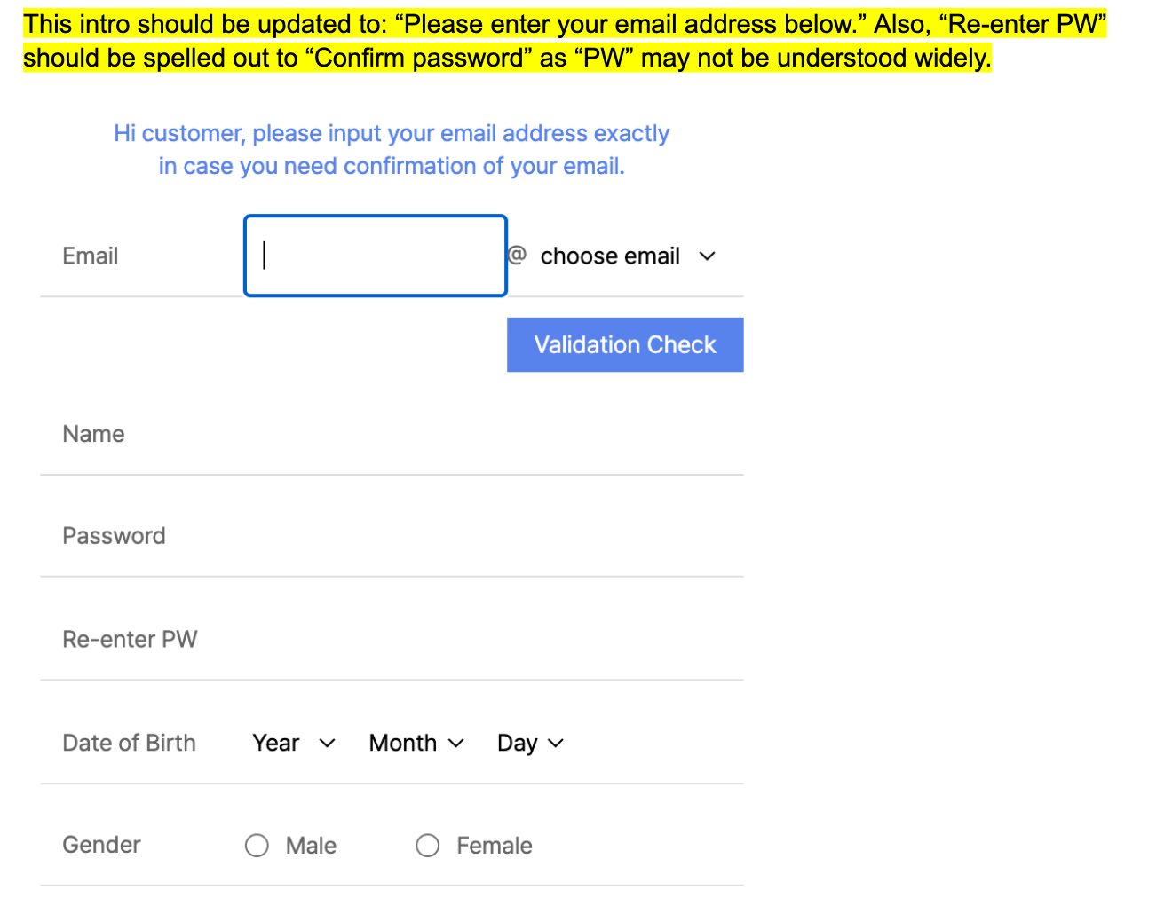
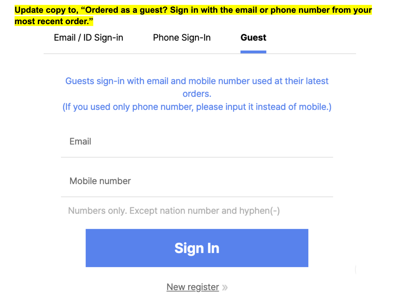
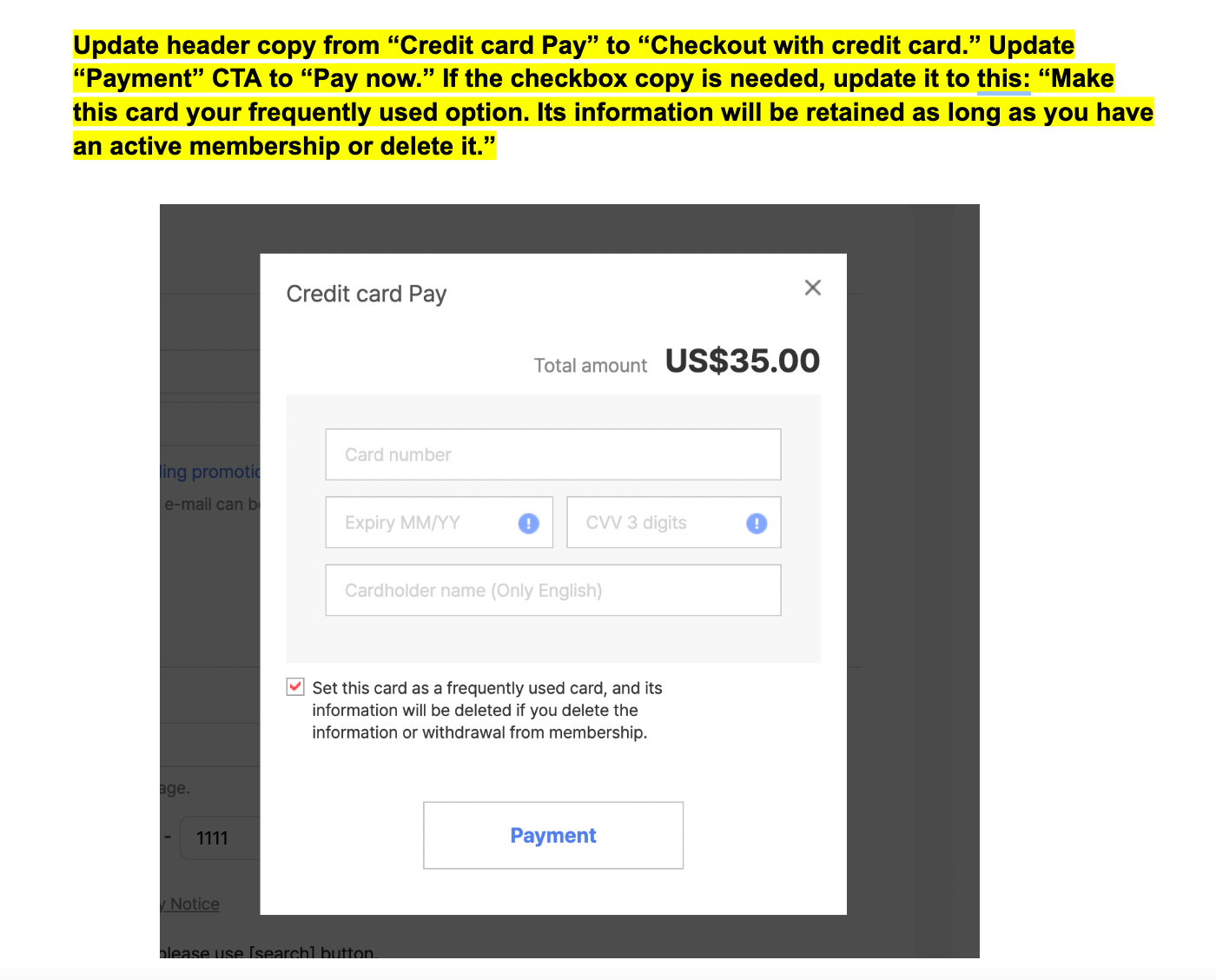
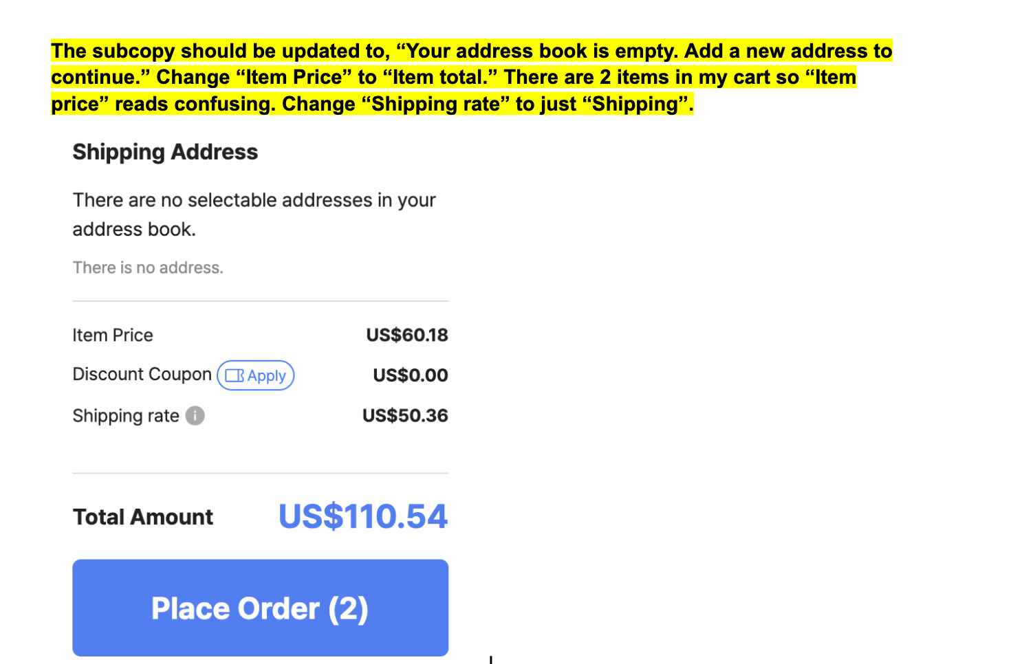
Business problem: When Wish was acquired by Qoo10, a Korean-based marketplace, they wanted to merge the two sites. However, the existing UX copy was problematic, marred by numerous errors and excessively verbose language.
Solution: To address this, I conducted a comprehensive audit of user flows, including the checkout process, to ensure the language was clear and concise. Below are a few examples of the updates I requested from the team.
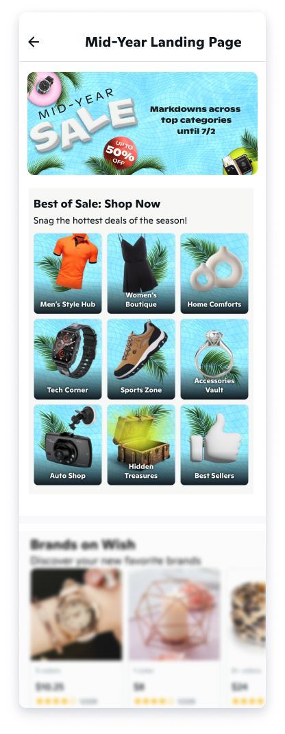
Business problem: The merchandising team needed to elevate the mid-year sale by featuring category icons with fun, lively copy instead of straightforward text.
Solution: First, I crafted introductory copy that conveyed a sense of urgency and excitement, encouraging users to take immediate action. Then, I created playful and engaging naming options for the categories. Working closely with the design team, I ensured that the names harmonized perfectly with the visual elements, creating a cohesive and captivating user experience. This collaboration resulted in icons that not only caught the eye but also conveyed a sense of excitement and energy, enhancing the overall appeal of the mid-year sale and driving user engagement.
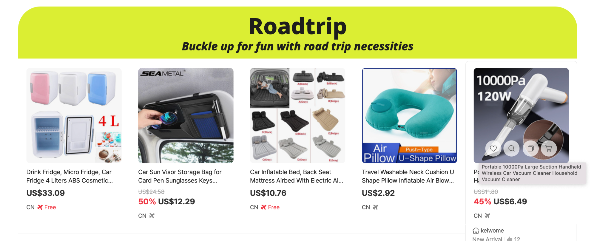
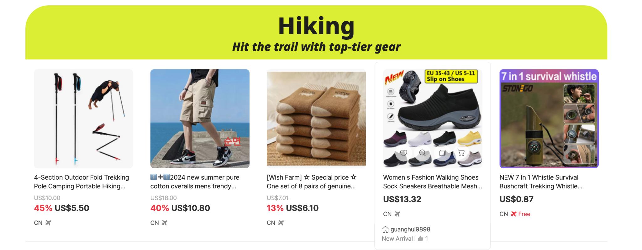
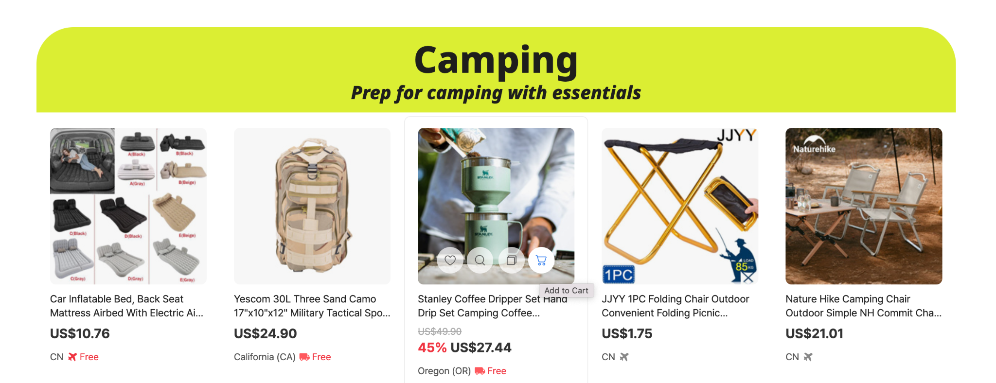
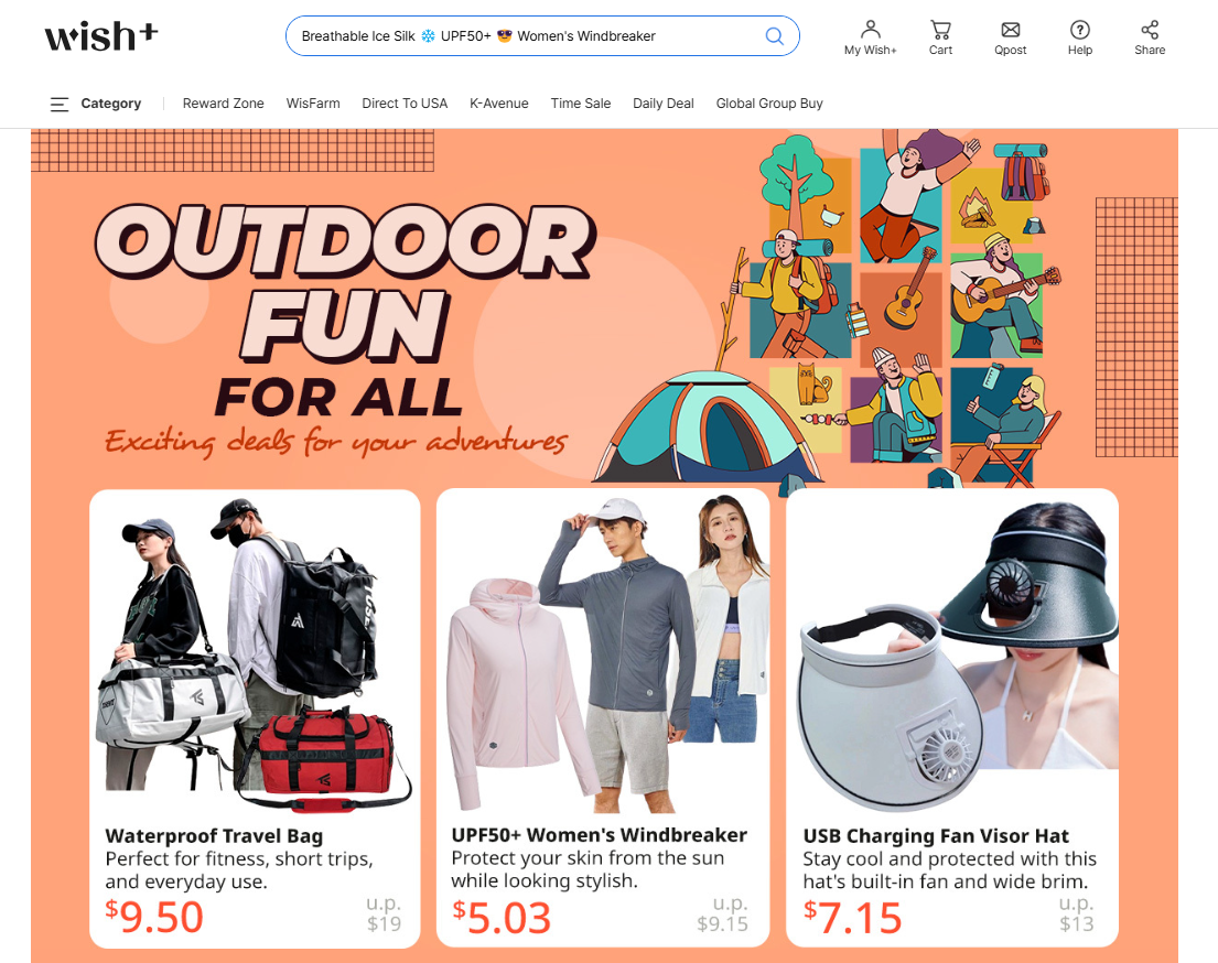
Business problem: The merchandising team wanted to launch a campaign to promote gear across all outdoor activities.
Solution: I came up with the campaign name "Outdoor fun for all" to be inclusive for all categories which ranged from hiking to camping.
I rewrote the product titles and descriptions for highlighted products to be easier for users to scan. For example, for the first item on the left below, the merchant listed it as: "Travel bag large capacity women's multifunctional fitness bag men's portable short-distance lightweight waterproof travel storage luggage bag trendy." I reduced it to "Waterproof Travel Bag" and then noted the key features in the description in an easy-to-scan, concise way: "Perfect for fitness, short trips, and everyday use."
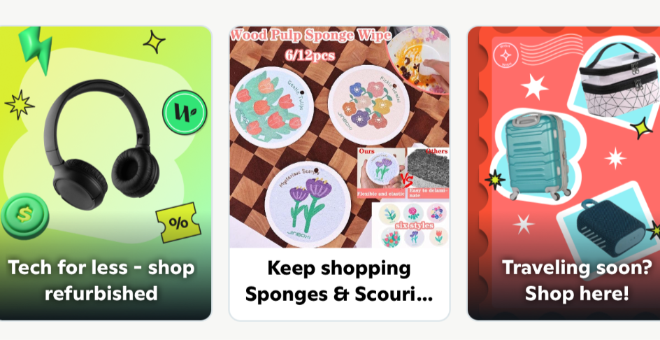
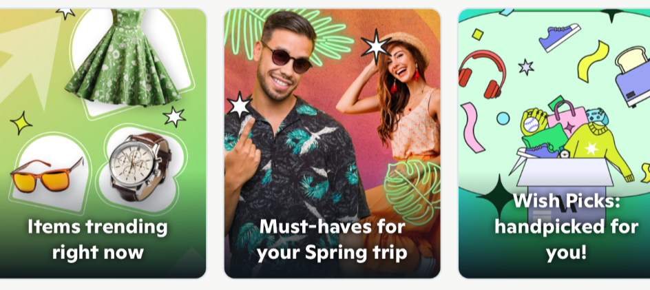
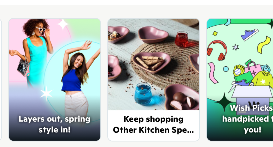
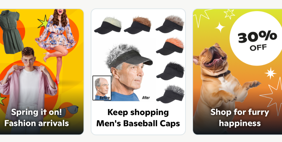
Business problem: The team at Wish wanted to test out using small banners with microcopy instead of the flashy large marketing banners which prevented users from seeing the new features on their feeds. Rather than opting for conventional, straightforward UX language, they still craved vibrant, marketing-driven copy.
Solution: I worked on weaving concise and engaging narratives to showcase the diverse range of items available on the platform. By infusing the banners with captivating copy, I aimed to not only grab users' attention but also provide them with an immersive and enjoyable browsing experience.